
Exploring an industry in flux — Brand Architecture, Beyond Beer and Reinvention
This piece was provided by CODO Design, a food and beverage branding firm. Join 5,500+ other beer industry pros who receive the Beer Branding Trends newsletter each month covering trends, currents and actionable advice from the front lines of beer branding.
Beer branding and package design quality has reached an all-time high. It’s rare that I see a new brewery come to market that hasn’t invested at least something into proper branding and packaging. Contrast that with, say, your average off-premise planogram in 2011, and you have a markedly different story.
And with the continued blurring of category lines, you’re seeing an even better level of design across the board as CPG branding best practices make their way over to the beer aisle. As part of our branding (and/or rebranding) process, we’ll often conduct a competitive set audit. This has us walking through beer aisles, coolers and a variety of chain retail and off-premise sets to see what’s out there. How does everything look? What’s interesting? And are there any opportunities for differentiation?
This section catalogues all of the the branding and package design trends we’ve seen emerge from this field work over the last year. As a reminder, the reason we’re highlighting beer branding trends isn’t to celebrate good design — it’s to explore how that good design can help you sell more beer and grow your business. Knowing that, let’s see what’s tipping right now.
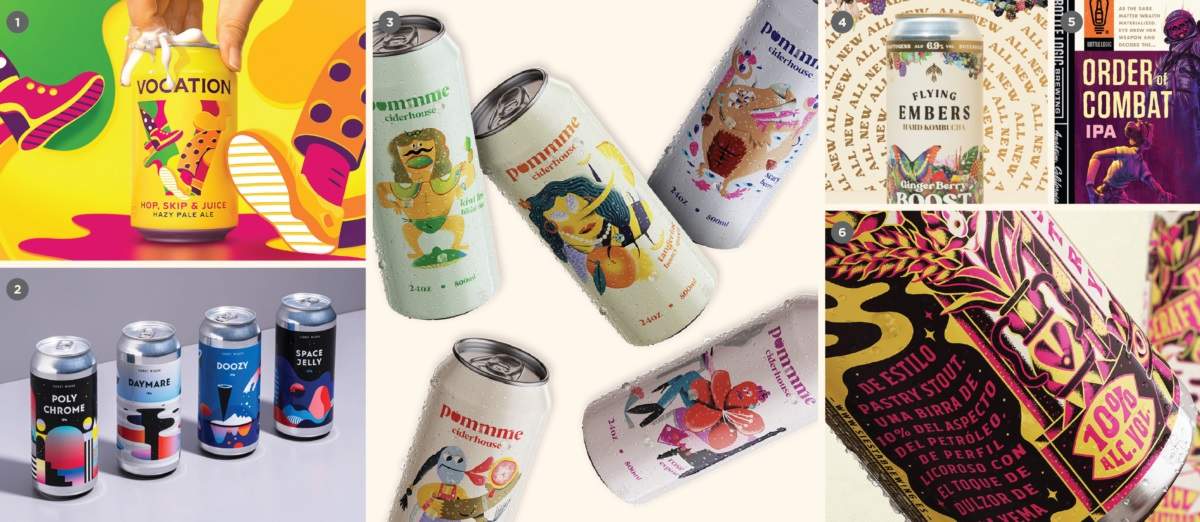
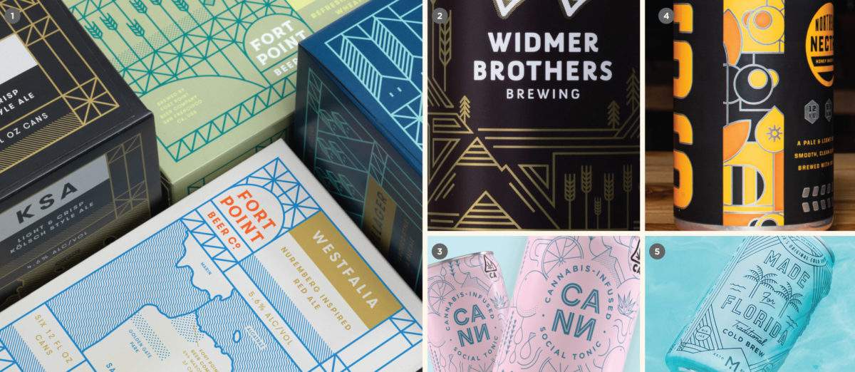
Investing in illustration
Beautiful packaging is so hot right now
In the early days of craft beer, packaging festooned with illustration was the norm. While there is no one particular reason for this, we surmise that industry pioneers delighted in releasing eye-catching packaging the likes of which Big Beer would never touch lest they defy that Big Beer aesthetic canon.
Whatever the cause, heavily-illustrated packaging is simply what was done. You had a local artist, or perhaps someone in your family, draw up a label. You slapped that bad boy on a bottle and called it good. But, as the industry gradually became more competitive (and craft buyers became more sophisticated along the way), an elevated sense of design and polish emerged. Incidentally, this heightened sense of visual literacy led to macro-level aesthetic trend swings from heavy illustrated to minimal, back to maximal, to minimal again, and now we’re swinging right back to illustration.
The trend we see today, in particular, is a real investment in illustration. Mind you, not the kind of amateurish, homespun and/or heavy metal-ish stuff we saw in the early days of craft beer. But beautiful, immersive, fully-illustrated packaging. Speaking as a designer, the illustration work that we’re seeing today is as good as it has ever been in this industry. It is beautiful, and the people behind it are immensely talented.
Increasingly, as more and more breweries trend towards minimalism and a strategic use of color blocking to billboard on shelf, illustration is just starting to stand out again. We are seeing a real trend of breweries paying good money to develop illustrative assets, with the goal of making these assets synonymous with their respective brands over time.
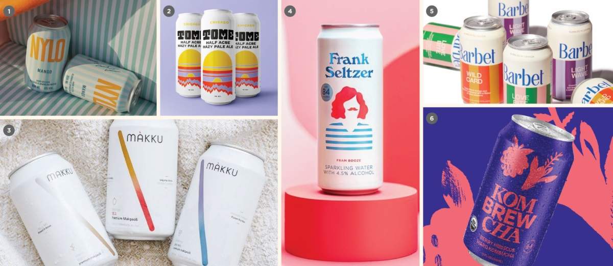
“Minimal Plus”
How to be minimal but still stand out
Minimalism has been a broader movement in the cultural zeitgeist for a decade or more. To wit, we’ve written about its role within craft beer, year after year, for just about as long. So, there’s nothing particularly revelatory here.
That said, if we can dig a bit deeper, an obvious problem emerges when a brewery heavily invests in a minimal visual direction while so many other breweries are taking the exact same tack. Just like any of these other trends, if you have twenty different breweries in your market doing the same dance, it becomes hard to stand out from the pack.
Where does that leave the brewery that favors a minimal aesthetic, but still wants to stand out from all those other concerns? Enter “Minimal Plus.” This is a term we’ve made up, so bear with us as we try to articulate what we’re seeing on this front. Minimal Plus still utilizes predominantly negative space, with plenty of room to breathe on, say, a can surface. But this otherwise stark and austere can might have a specific element that adds just a little something beyond run-of-the-mill “Bifurcated” color blocking. This could include a simple illustration, interesting typography or dialed-back tonal patterning.
We see this approach as an extension of a minimally-branded packaging strategy, and for practical purposes, we regard it the same. But it could make the difference in a market overrun by minimalism. And it does stand out, just a little, which matters more today than ever.
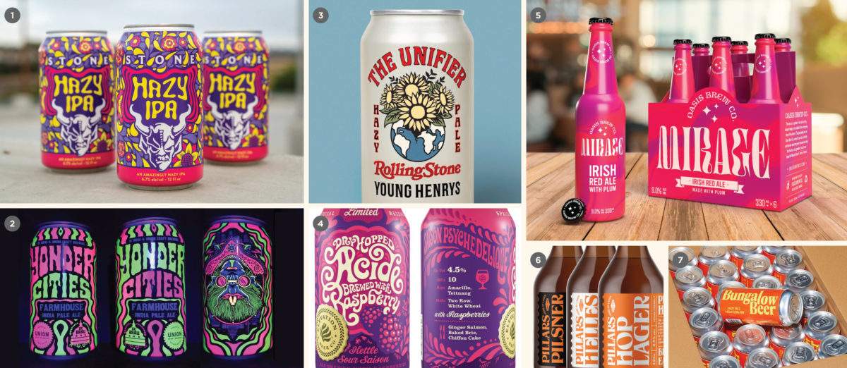
60’s/70’s vintage revival
What’s old is new again
We can’t pinpoint any particular cultural movement that is driving this aesthetic, other than the inherently incestuous nature of social media, and in particular, the social media design community on dribble and Instagram. Pair this with creative cross-pollination from the cannabis industry, and for whatever reason, what’s old is new again.
But this is how visual culture works. Something will pop — either a product, or a TV series, or a particular style, or project from a notable designer or firm. It suddenly becomes all the rage, and inevitably, a litany of copycats emerge. Over time, enough of this work accumulates that some food and beverage branding firm in Indiana is able to cobble together enough examples and call it a trend.
But is it a trend because it’s actually a powerful market force, or reflective of some sort of deeper cultural relevance? Or is it a trend simply because we all see it a lot online? We don’t know. It looks kind of cool, though. Perhaps this is food for thought regarding trends in a broader sense. And maybe it’s useful to think of it as more of a fad — like a nice, loud sweater that’s in right now. But tomorrow? Who knows?
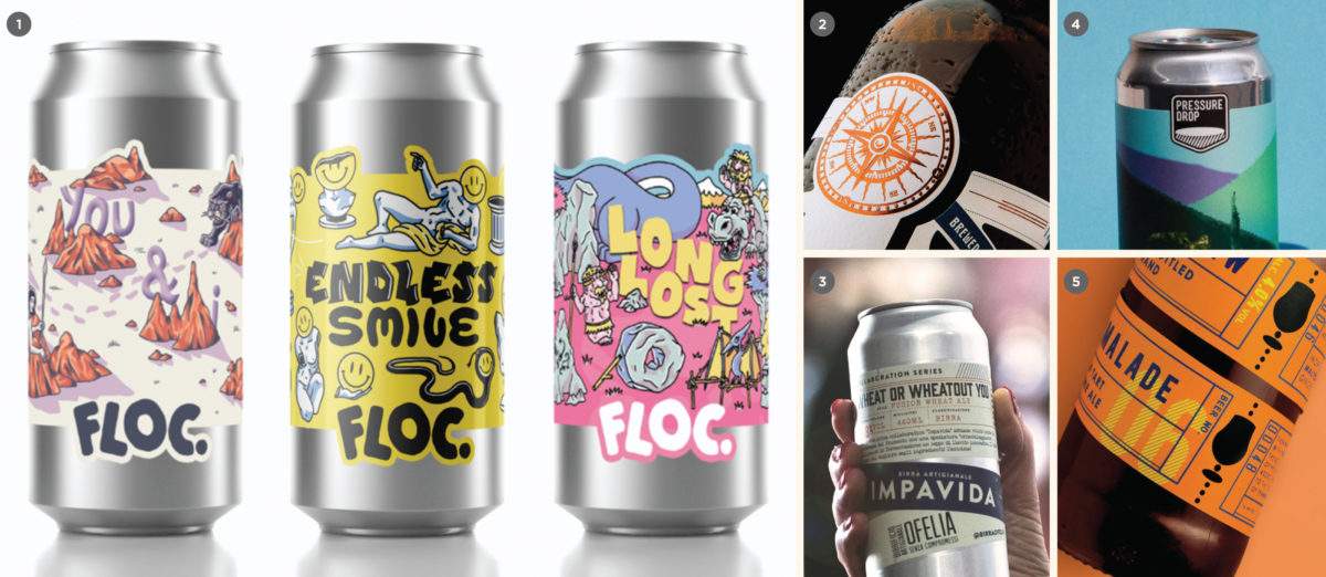
Monoline
An aesthetic built for DTC brands
Monoline illustration work is nothing new. It’s been present as a force in craft for around seven or eight years in earnest (and much longer elsewhere). But, it’s worth mentioning that we are seeing a lot more of it today. If I had to guess, I’d might say that it has something to do with a move to direct-to-consumer (DTC) models, online ordering and beer branding and packaging existing just as much in the digital space as it does in physical space.
Monoline aesthetics will increase in utility as more digitally-native Bev Alc brands come to market. The bold, even lines minimize to avatar size cleanly in your browser, but scale up gracefully on larger formats without losing fidelity. It looks clean, contemporary and communicates well. In short, it’s a versatile look, and while it could certainly get lost in a sea of sameness (I’m looking at you, tech industry), a monoline approach could stand out in an otherwise illustration-heavy or overly minimal competitive set.
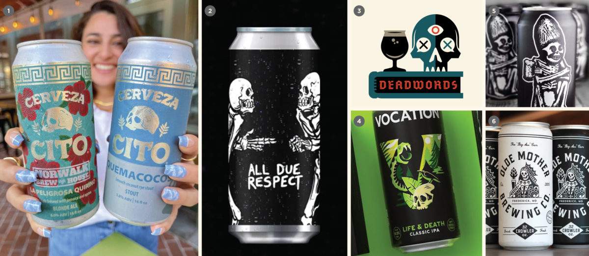
Skulls
A trend for these unprecedented times
Skulls and crossbones and all sorts of fun, macabre stuff like that have been a thing in craft beer for years. We’ll typically hear clients and industry heads refer to this as the “death metal” aesthetic, but this particular thread we’re pulling here has less to do with the rivers of blood and “pile of sticks” typography. We’re simply noticing a lot of skulls being used as visual elements, whether as a main element of a logo lockup, or as a secondary icon playing a supporting role.
We’re also seeing a sub-trend of Día de los Muertos sugar skull designs in craft beverages. Calling an entire cultural aesthetic a subtrend might seem glib, but we aren’t seeing enough of it to call it a movement within beer on its own (stay tuned for 2023, maybe?). We’re just noting it here for future reference.
Custom dielines
A relatively low cost, high impact production trick
Ball raising its minimum painted can order requirements will undoubtedly lead to an increase in sleeved and pressure sensitive labeled cans. In the case of pressure sensitive labeled cans in particular, we’re seeing a lot more people take advantage of the cool production opportunities that adhesive labels afford. Ultimately, die cutting is a relatively inexpensive way to make an impact on the shelf, and we think more breweries should consider it as a tactic.
Pro Tip: this effect can be faked with a clear (or foil) background. This allows you to get the same effect without using a custom dieline. However, we always advise seeing printed examples and a proof from your printer to make sure you have a good idea how the final product will look in-hand before committing to this.
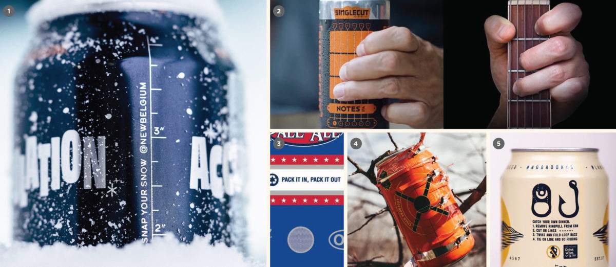
Interactive packaging
Don’t just stand there. Do something.
Interactive packaging is a fun trend that encourages your audience to do something physical (beyond shotgunning it) with the can or bottle itself. This is almost always paired with a prompt to post on social media and can work wonders on that front. A little of this goes a long way. Consider sprinkling it wherever it makes sense on your packaging to offer your fans a brief moment of delight.
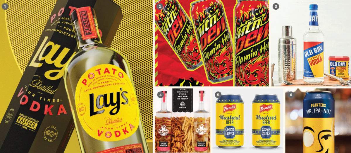
Co-branded stunt beverages
Limited Release Postmodern meme fuel
Small breweries and Bev Alc companies have been liberally stealing borrowing IP from well-known CPG brands for years (think Oreos, various candy and cereal brands, etc.). We’re now seeing a wave of more thoughtful, officially sanctioned co-branded products, often made in partnership with major consumer brands and/or celebrity influencers.
These products are usually short-lived, small batch and released primarily to be shared as memes on social media, boost quick short-term engagement and stay top-of-mind in a given media cycle.
This phenomenon isn’t strictly a visual trend. We could have just as easily placed this with the Brand Architecture portion of this review. But we’re including this here because these collaborations tend to have a highly visual component that often mimics the branding cues or personality of the parties involved. These are Postmodern, short-lived, hype-driven meme fuel. While their long-term impact is frankly questionable, you can expect to see a whole lot more of them over the coming years.
Read the rest of this post over on CODO’s site.
Join CODO’s Beer Branding Trends newsletter for monthly field notes covering trends, currents and actionable advice from the front lines of beer branding.
Leave a Reply
You must be logged in to post a comment.