
This piece was provided by CODO Design, a food and beverage branding firm, and authors of Craft Beer, Rebranded. This book (and companion workbook) is a step-by-step guide to help you map out a successful strategy for rebranding your brewery. Join 5,000+ other brewing industry folks on the Beer Branding Trends newsletter to receive monthly field notes covering trends, currents and actionable advice from the front lines of beer branding.
It’s hard to identify unique visual trends in craft beer packaging like we have in years past. Or more importantly, these trends no longer rise to prominence and clearly affect the rest of the industry like they used to. The market has become so saturated with great design that I’m not sure how valuable it is for me to tell you about a certain production technique or pattern that’s in right now anyway.
The reason we’re here discussing beer branding trends isn’t to celebrate good design — it’s to explore how that good design can help you sell more beer and grow your business.
All of that being said, CODO is a branding firm. And since you’re reading this, chances are that you’re a designer as well (or someone tasked with selling more beer). In that spirit, and so we don’t leave you hanging, here are a few fun visual currents we’re seeing this year. One quick note: a lot of these trends bleed over into, or come from, other beverage verticals. As is the throughline of this entire piece, with so many breweries making non-beer products like hard seltzers and kombucha, plus design blog and Instagram echo chambers accelerating trends, these all inform each other anyway.
In 2021, beverage branding trends are beer branding trends.
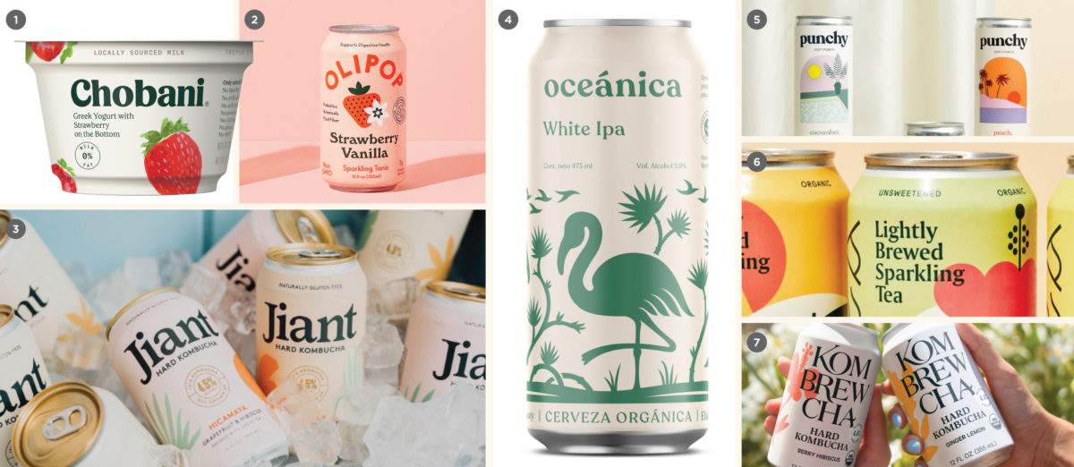
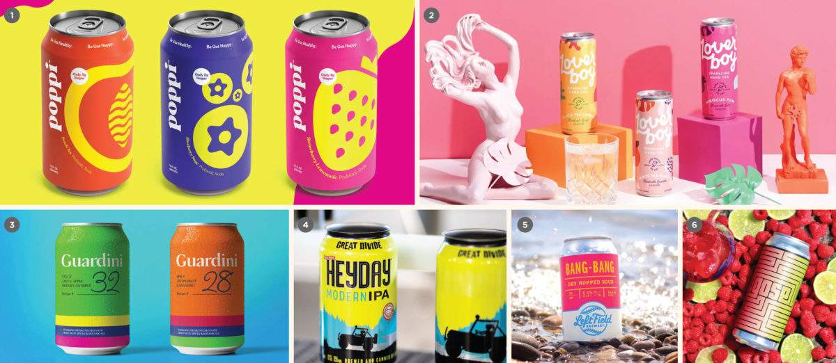
Chobani-fication
From the dairy case to the beer aisle
Greek yogurt brand Chobani launched a successful (and strongly differentiated) rebrand back in 2017 that took the design world by storm. Chobani’s rebrand sported a look that was at once unexpected and comfortable, tactile and organic; the overall effect somehow effortless and bold at the same time. Perhaps more importantly, the new look tapped into the retro design fetish that Millennial and now Gen Z consumers can’t. seem. to. shake.
This rebrand was so successful that it began to influence art direction in many categories beyond the humble yogurt aisle. Fast-forward a few years and this look has been adapted (and occasionally copied verbatim) across the food and beverage industry as a whole. Predictably, it has taken root in craft beer branding and art direction as well.
What are the hallmarks of Chobani-fication? Soft, tonal pastels and “nude” color palettes. Luscious, organic shapes and bold, simplified illustrations. 1970s serif typography with chunky stroke widths that look like a sleeker, hipper version of Cooper Black. Creamy, slightly off-white backgrounds that suggest paper aged by time and loads of whitespace.
This is a gorgeous aesthetic, but it will likely become a victim of its own success. Given another few years, this approach will probably look dated and feel all too commonplace.
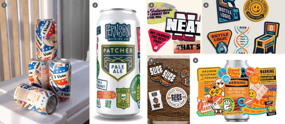
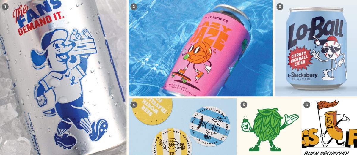
Slaps
You missed a spot
Plastering stickers (or “slaps,” as the kids call ’em) is a lively visual trend that has gained prominence alongside the growth of small-batch beer drop culture. And it’s seen a bit of a revival during Pandemic Times, as breweries were forced to get more creative with the packaging resources available (think direct-to-consumer delivery programs and shipper boxes, trays and delivery bags, etc.).
Characterized by a field of haphazardly-placed, overlapping sticker graphics, this look evokes an eye-catching collage that has been made over time, perhaps by multiple people. Think of a suitcase covered in stickers from around the world.
It’s difficult to pinpoint the origin of this look. It may be sourced from the visuals of street art and graffiti, or perhaps takes a cue from West Coast skateboarding and sneaker brands. Perhaps it arose organically from tipsy beer festivals (remember those?) from attendees who woke up the next morning with foggy heads and seven thousand different brewery stickers crammed into their jorts pockets. At this point it’s all a little blurry.
Regardless of origin, an industrial cooler covered with dozens of stickers is a universal sight in bars and taprooms across the world, so this aesthetic is a comfortable fit for craft drinkers.
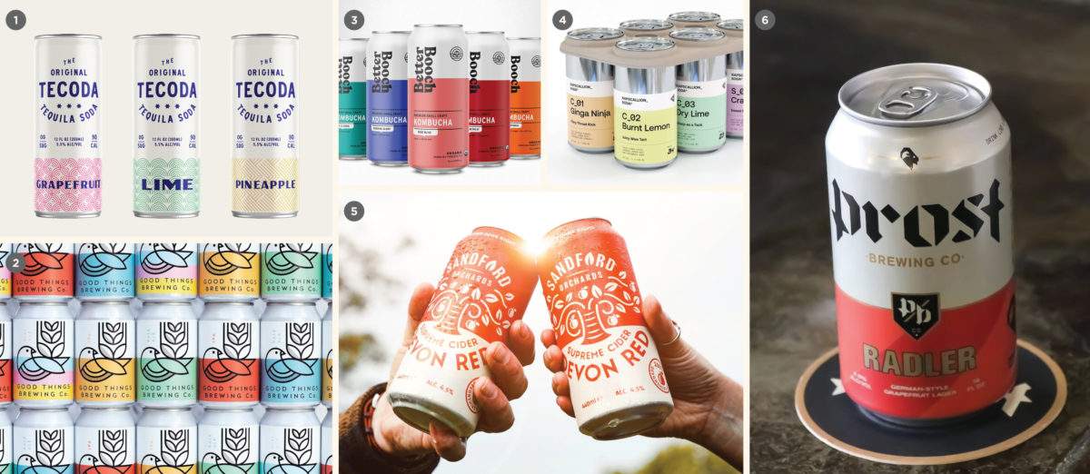
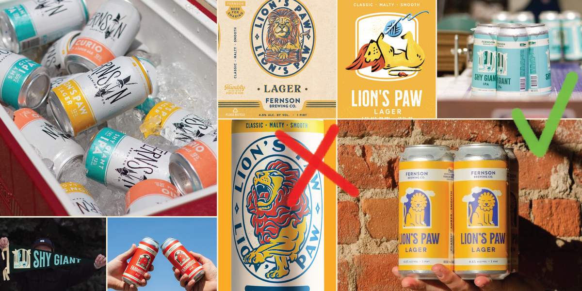
Bifurcation, Evolved
The reign of terror continues
Visual bifurcation in packaging has been around for much longer than when we first wrote about it (back in 2018). Perhaps this is a testament to its enduring power. For those new to the concept, bifurcation is an aesthetic where the visual surface of the package is “cut” in two by a visual element. Praised initially for it’s professional, consistent look on the shelf, and the ability for multiple SKUs to “billboard” together and create more stopping power in the shopping aisle, this trend has held the craft beer industry in an iron chokehold for years.
But not all is rosy in Bifurcation Land, and this approach to packaging does present certain drawbacks. Many breweries have shifted from relying on a core 3 or 4 beers to embrace more Instagram-friendly “rotation nation” release schedules. Since there are only so many colors in the rainbow, a rigid bifurcated template can become confusing or visually stale, release after release. To say nothing of the sheer amount of breweries that are using some form of bifurcation in their packaging strategy: it’s harder to stand out with this look compared to years prior (unless you were an early adopter and have cemented this look in your market).
The prevalence of bifurcation has forced breweries to push the limits in order to gain all-important shelf presence. Packages divided by slashes, ribbons and chevrons have cropped up in a bid to stand out from the plain-Jane approach to bifurcation. Increasingly, we are seeing landscapes, illustrations, patterning and other unique elements coming into play to break up the monotony. It will be interesting to see how this evolves as breweries continue to push the envelope.
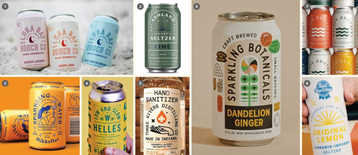
V. Vibrant
Can so bright, I gotta wear shades
We’ve been tracking the rise of colorful, eye-catching beer labels for a while now, but this trend has finally hit a new gear. In a bid to get noticed at retail, breweries are peacocking around in fully vibrant, neon, saturated colors to stand out from the pack. As important as a strong retail presence is, we also suspect this trend is informed by the need to stand out on the Instagram feed, paired with younger consumers coming of age and bringing their visual preferences to the table.
Increased competition have forced breweries’ hand to bite the bullet and invest a little more in printing per unit. As breweries continue to improve their packaging and deepen their understanding of the production process, we expect to see greater instances of specialty UV inks, foils, finishes, die cuts and other ostentatious eye-catching packaging treatments.
Vintage Mascots
Whimsy! Ice cold whimsy! Get your whimsy here!
A less prevalent (though no less impactful) trend we’ve noticed recently is the use of old-school mascots. Derived from early cartooning, collegiate sports iconography, and other bits of retro culture, this trend presents a unique opportunity to project a sense of friendliness and personality on a package. Googly Betty Boop eyes, goofy white gloves, and anthropomorphized objects with comically bendy limbs abound!
Mascots can be a tricky subject in branding, and in our opinion, they are rarely done right. For craft beer, the vintage approach to this trope seems to make sense. It welcomes in new drinkers with warmth and nostalgia, and reassures experienced drinkers with a fresh sense of whimsy (and even a little irony). Ultimately, we think this works because there is major precedent for this type of mascot in retro beer advertising (think of old Guinness or Pabst adverts involving burly strong men and beer-obsessed tropical animals).
TLDR: I don’t think you should build your brand around a mascot, but they can be fun to include in the mix to keep things fresh.
Tombstone Typography
What do you want on your tombstone?
One of the most persistent typography treatments we’ve seen over the last year is a brand name, product name, or other phrase, set on an exaggerated, arched baseline — we call this a “tombstone” build. This element brings an architectural sense of class and composition to a label, and may indicate a renewed interest in art nouveau layouts or influence from old-school record labels.
Why has arched typography caught on? Our best guess as designers: it’s a great way to get longer brand names or SKU names to fit on the face of a package, without having to turn the package around to read it. Be careful with this one though: kerning on a curved baseline is notoriously tricky, and readability can take a hit with more decorative typefaces.
Read the rest of this post (all 20,000 words of it) over on CODO’s site: https://cododesign.com/2021-craft-beer-branding-trends/
Join CODO’s Beer Branding Trends newsletter for monthly field notes covering trends, currents and actionable advice from the front lines of beer branding.
Leave a Reply
You must be logged in to post a comment.